


Preview information about TabView and NavigationView, two new controls we are adding to the VCL.
Feature Preview: This blog post is based on a pre-release version of the RAD Studio software and it has been written with specific permission by Embarcadero. No feature is committed until the product GA release.
Embarcadero is continuously focused on helping our customers build Windows applications with a modern UI, while maintaining their investment in the VCL library. Over recent years, we added new tab controls focused on managing forms (and MDI forms, migrating them to today’s world). This effort is continuing in the coming release with two new VCL controls for navigation: TabView and NavigationView. They follow patterns used by current Windows applications (and the WinUI3 user interface paradigm), but they are regular VCL controls and are designed to work with existing forms, frames, page controls, and application code.
We worked on them together because they solve related problems. TTabView provides horizontal tabs, generally for documents or views. TNavigationView provides the vertical navigation commonly used for the main areas of an application.
Table of Contents
The New TabView Control
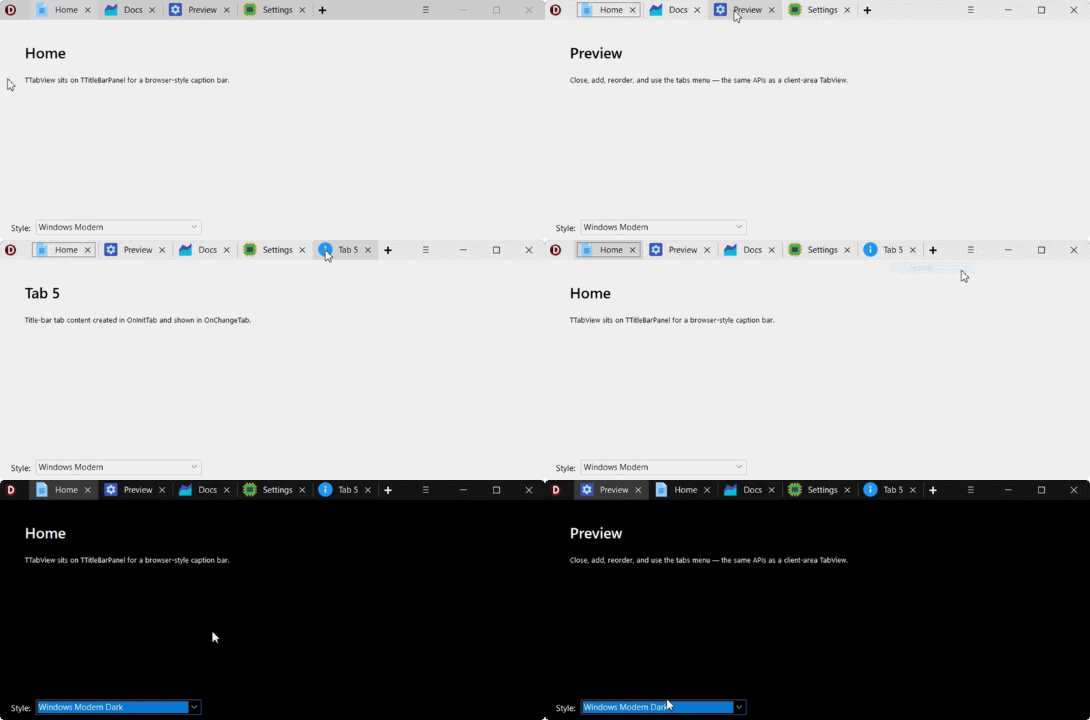
The TabView control is a new alternative to the TabSet control. A tab can be associated with a form or with another control, so you are not forced into a particular content container. Each tab can have an image, multiline text, and an optional close button.
The control also includes the pieces that normally turn a basic tab strip into quite a bit of custom code: an add-tab button, a dropdown listing all tabs, and scroll buttons when the tabs no longer fit. TTabView can be placed on a TTitleBarPanel, which makes it possible to use the tabs in a custom title bar similar to current browsers and development tools.
The New NavigationView Control
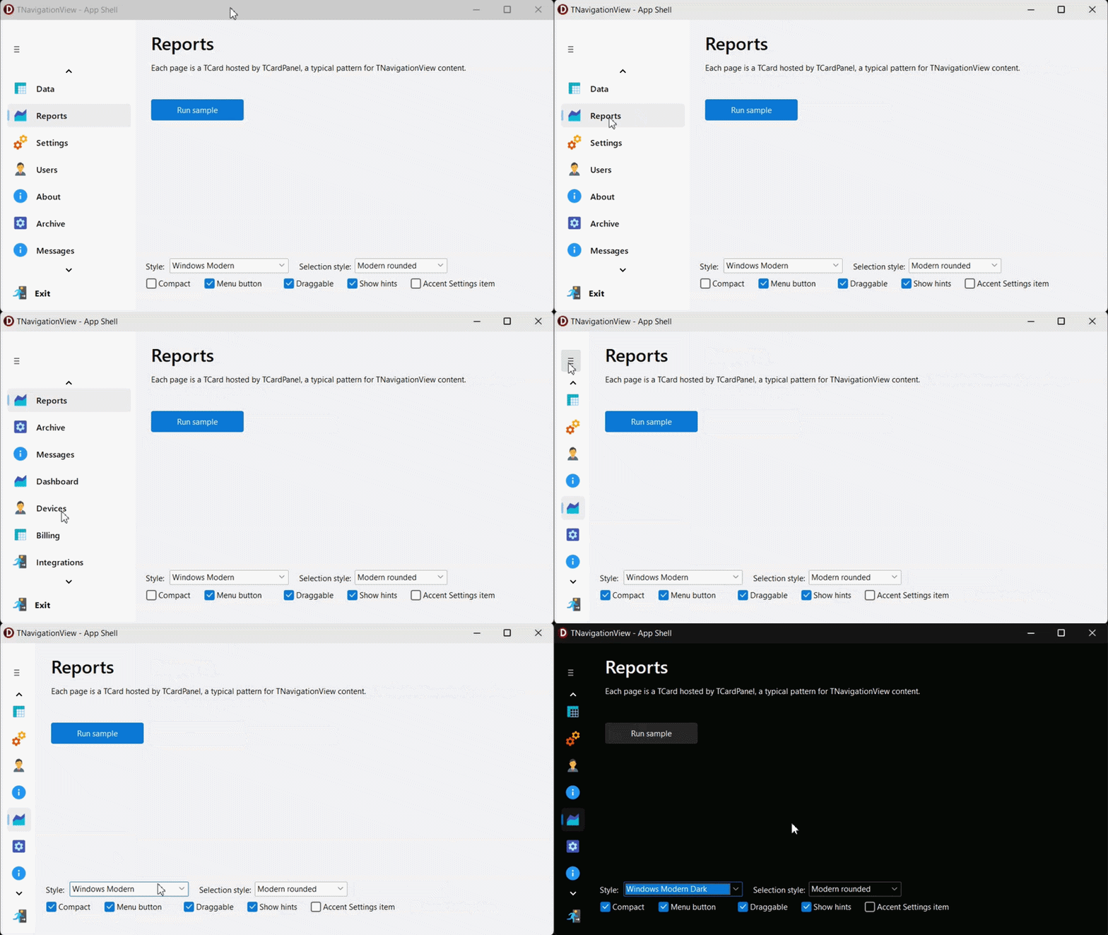
The NavigationView control is a vertical list of navigation items. An item can point to a page in a multipage control, a frame, a card in TCardPanel, or content managed by a third-party page control. This loose association is deliberate: an existing application should not need to move all of its content into a new container just to use the control.
The control has normal and compact modes. Normal mode displays an image and text; compact mode keeps the images and reduces the width of the navigation area. A built-in menu button can switch between the two. Items can have multiline captions and hints, can scroll with the mouse wheel, and can optionally be reordered with drag and drop.
Styling and Custom Drawing
There are several built-in selection styles, including themed, colored, rectangular, and rounded variants. Colors can follow the active VCL style, or you can choose your own. For applications that need more control, drawing events let you customize the entire item or only its contents.
The two controls can also be used together. For example, NavigationView can select the main area of an application while TabView contains the documents opened in that area. Or you can use either control on its own.
The VCL Keeps Improving
We have kept adding new UI controls to help modernize existing VCL applications, but also for building new modern looking ones, and this is another step in that direction. We plan to keep going in this direction, while we focus a considerable effort improving our support for styles, HiDPI and many other modern features of the library, also by addressing customer reported tickets in this area.
Feature Preview: This blog post is based on a pre-release version of the RAD Studio software and it has been written with specific permission by Embarcadero. No feature is committed until the product GA release.



Reduce development time and get to market faster with RAD Studio, Delphi, or C++Builder.
Design. Code. Compile. Deploy.
Free Delphi Community Edition Free C++Builder Community Edition



Nice new features for the easy access of UI elements. and yeah adding more improvements are definetly necessary for an modern UI implementation. I think it would be also quite helpful to have undo(ctrl + z) feature in the dfm to make the designing more user friendly.