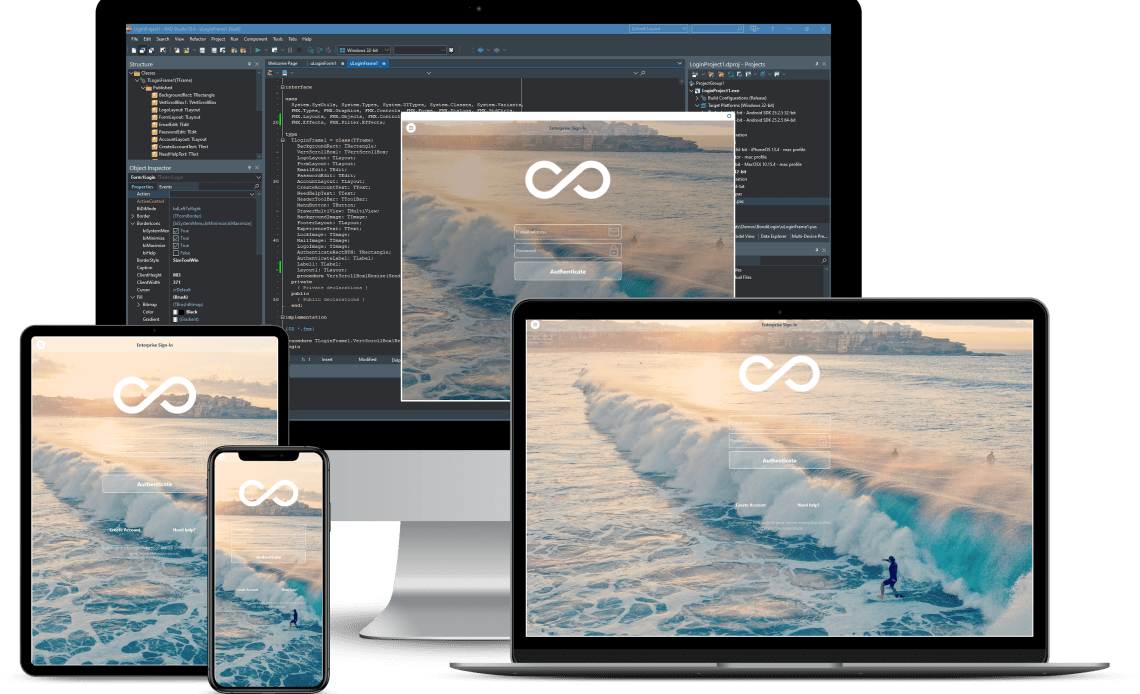
The NativeControls sample shows the use of the Native Controls of FireMonkey. To this end it uses several components that are configured with its ControlType property set to Platform in order to have the native styling of that control.
Note: Only iOS and Windows support native controls. The following links provide a list of controls that support native presentation on iOS and Windows platforms. The value of ControlType property on any other platform does not have any effect.
Table of Contents
Location
You can find the NativeControls sample project at:
- Start | Programs | Embarcadero RAD Studio Sydney | Samples and then navigate to:
Object PascalMulti-Device SamplesUser InterfaceNativeControlsCPPMulti-Device SamplesUser InterfaceNativeControls
- Subversion Repository:
- You can find Delphi and C++ code samples in GitHub Repositories. Search by name into the samples repositories according to your RAD Studio version.
How to Use the Sample
- Navigate to one of the locations given above and open:
- Delphi:
NativeControlsDemo.dproj. - C++:
NativeControlsDemo.cbproj.
- Delphi:
- Select the target platform in the Projects Window.
- Press F9 or choose Run > Run.

Files
| File in Delphi | File in C++ | Contains |
|---|---|---|
NativeControlsDemo.dprojNativeControlsDemo.dpr | NativeControlsDemo.cbprojNativeControlsDemo.cpp | The project itself. |
MainFrm.pasMainFrm.fmx | MainFrm.hMainFrm.cppMainFrm.fmx | The main form. |
Implementation
FireMonkey provides native presentation for certain visual components. Although the default value of the ControlType property is Styled, which means that the control has the standard FireMonkey presentation, if you set the ControlType property to Platform, the controls have the native styling. In the sample, when you run the application, it shows four tabs labeled as Edit, Memo, Standard and ListView. Each tab contains several controls. All the controls have the ControlType property set to Platform in order to have the native styling of that control. Moreover, the controls are also configured with other properties that are explained below.
- TabItem1, which is labeled as Edit, contains five edit components:
- The Edit1 component is configured with the TCaret.Color property set to
Green. - The Edit2 component uses the TextPrompt property, which is used to display a message when the Text property is empty. In this sample it shows this message:
First Name, which is cleared from the entry field as soon as the user begins to type into the edit field. - The Edit3 component has a TClearEditButton component attached. It is used for clearing text when you want to quickly erase the text in the edit box.
- The Edit4 component has the TextAlign property set to
Center. - The Edit5 component has the StyleLookup property set to
transparentedit.
- The Edit1 component is configured with the TCaret.Color property set to
- TabItem2, which is labeled as Standard, contains the following components:
- TabItem3, which is labeled as Memo, contains three TMemo components:
- The Memo1 component has the StyleLookup property set to
transparentmemo. - The Memo2 component is configured with the CheckSpelling property set to
True. Moreover, some properties of TextSettings are configured so that the text is underlined and highlighted in bold and italics. Finally, the FontColor is set toLightcoral. - The Memo3 component has the PhoneNumber, Link, Address and CalendarEvent options of the DataDetectorTypes property set to
Truein order to detect these types of information in the memo text.
- The Memo1 component has the StyleLookup property set to
- TabItem4, which is labeled as ListView, contains a TListView component that contains a list of names organized by their jobs.
Please check the Native Controls Sample’s original post via the next link:
http://docwiki.embarcadero.com/CodeExamples/Sydney/en/FMX.NativeControls_Sample
Head over and check out the full source code for the native controls demo in Delphi on GitHub.
Head over and check out the full C++ source code for native controls in C++Builder on GitHub.
Design. Code. Compile. Deploy.
Start Free Trial Upgrade Today
Free Delphi Community Edition Free C++Builder Community Edition


