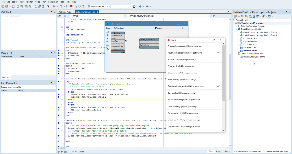
Viewing your valuable data in a List with ultimate user experience becomes the essential need in Modern Desktop and Mobile Applications. Some of the usecase needs to view the list items as check list .e.g Selecting Multiple items Add or Delete from a List. Delphi/C++ Builder offers robust components to do the job at design time or runtime with less code and made developer life easy.
ListViewCheckList Sample shows how to make the display mode of a TListView behave as a check list, where you can tap items to add or remove them from the current selection.
You can find Delphi and C++ code samples in GitHub Repositories. Search by name into the samples repositories according to your RAD Studio version.
Components used in ListViewCheckList App:
TListView: FireMonkey component that you can use to hold and present various types of items.
TBindingsList: Built on the TCustomBindingsList component and publishes additional properties that can be accessed from within the Object Inspector. Add a new binding and select TLinkFillControlToField under Quick Bindings. TLinkFillControlToField: Links a control to a field and fills the control with possible values.
TPrototypeBindSource: It can be used to generate sample data for the LiveBindings in your project. After you prototype an application, configure the real data source so that you see the new data source fields in the LiveBindings design.
Implementation Details :
When you run the application, it shows a list view. Tapping an unselected item shows a checked check mark on its right-hand side. Tapping a selected item hides that check mark.This application keeps a list of indexes of selected items.
The item appearance of this list view in display mode is the default value, ListItem, but this appearance has been modified. The properties of the TListView.ItemAppearance.Item.Accessory appearance object have been changed as follows:
- AccessoryType has been set to Checkmark.
- Visible has been set to False.
To show or hide check marks as you tap list view items, this application handles the OnItemClick event of the list view. The handler of this event shows or hides the Accessory appearance object and updates the list of selected items that the application keeps. This application also handles the OnUpdateObjects event of the list view, where it: Check out the full article in the DocWiki about the FMX.ListViewCheckList sample.

Adjusts the width of the Text appearance objects, so that text does not cover the check mark in the selected items.
Note: Sets the visibility of the Accessory of each list view item based on the list of selected items. This is necessary because the rotation resets the list items to their default appearances.
Reduce development time and get to market faster with RAD Studio, Delphi, or C++Builder.
Design. Code. Compile. Deploy.
Free Delphi Community Edition Free C++Builder Community Edition


