Author: Chris Chuah
I recently received some questions on how to display a circular badge icon and badge value on a tab item in TTabControl.
Badge icons are commonly set to indicate a status change. The number displayed on the badge is frequently tied to a local notification or a push notification that’s been received.
For example, popular social media apps show a badge value on the Notifications tab to show the number of new comments that you’ve received on a post while email clients display a badge value on the Inbox tab to indicate the number of unread emails.
In today’s post, I thought I would show you how to set the badge icon and value on a selected tab item. This works with both the default native styles as well as custom styles, including the styles that are part of the premium style pack.
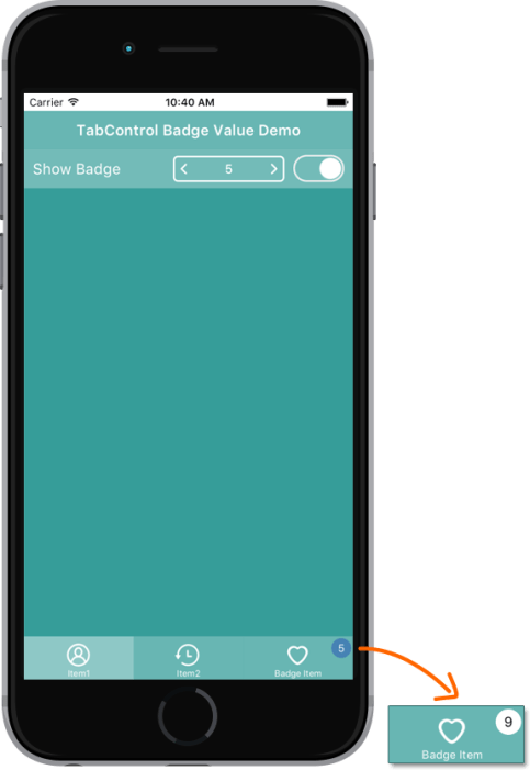
This demo uses a client aligned TTabControl with 3 tab items. After enabling the switch, a badge icon is shown on the “badge item” tab, and you can increment the value.

Note: Since this is just a quick demo to illustrate how to increment the badge value, we are using TSpinBox, but it’s recommended to use a TSpeedButton with the correct “stepper” styling when adding app navigation that allows the user to increase/decrease values. This is especially true for iOS to ensure you are adhering to Apple’s UI guidelines.
Example:
![]()
You can also customize the fill color of the circle along with the font color:


You can adjust the positioning of the badge icon as well. For example, it’s common practice on iOS to display the badge icon on top of the tab icon. Using the code shown below, you can easily shift the location of the badge as desired.
Platform styling:

Custom UI Styling using one of the premium iOS styles. Change to the positioning of the badge icon also apply to custom styles. See above for a code example.

Download the project here.
|
1 2 3 4 5 6 7 8 9 10 11 12 13 14 15 16 17 18 19 20 21 22 23 24 25 26 27 28 29 30 31 32 33 34 35 36 37 38 39 40 41 42 43 44 45 46 47 48 49 50 51 52 53 54 55 56 57 58 59 60 61 62 63 64 65 66 67 68 69 70 71 72 73 74 75 76 77 78 79 80 81 82 83 84 85 86 87 88 89 90 91 92 93 94 95 96 97 98 99 100 101 102 103 104 105 106 107 108 109 110 111 112 113 114 115 116 117 118 119 120 121 122 123 124 125 126 127 |
unit TabBadgeFrm; interface uses System.SysUtils, System.Types, System.UITypes, System.Classes, System.Variants, FMX.Types, FMX.Controls, FMX.Forms, FMX.Graphics, FMX.Dialogs, FMX.TabControl, FMX.Controls.Presentation, FMX.Edit, FMX.EditBox, FMX.SpinBox, FMX.StdCtrls, FMX.Layouts, FMX.ListBox, FMX.NumberBox; type TForm16 = class(TForm) TabItem1: TTabItem; TabItem2: TTabItem; BadgeItem: TTabItem; SpinBox1: TSpinBox; ToolBar1: TToolBar; Switch1: TSwitch; ListBox1: TListBox; ListBoxItem1: TListBoxItem; ToolLabel: TLabel; TabControl1: TTabControl; procedure BadgeItemPaint(Sender: TObject; Canvas: TCanvas; const ARect: TRectF); procedure SpinBox1Change(Sender: TObject); procedure FormCreate(Sender: TObject); procedure Switch1Switch(Sender: TObject); procedure StepperUpClick(Sender: TObject); private FBadge: Integer; FShowBadge: Boolean; procedure SetBadge(const Value: Integer); procedure SetShowBadge(const Value: Boolean); { Private declarations } public { Public declarations } property Badge: Integer read FBadge write SetBadge; property ShowBadge: Boolean read FShowBadge write SetShowBadge; end; var Form16: TForm16; implementation {$R *.fmx} {$R *.iPhone55in.fmx IOS} procedure DrawBadge(Canvas: TCanvas; const ARect: TRectF; const Text: string; const Color: TAlphaColor = TAlphaColorRec.Red); const Padding = 2; HorzTextMargin = 6; VertTextMargin = 4; var R: TRectF; TextSize: TSizeF; Brush: TBrush; BadgeRadius: Single; begin Canvas.Font.Size := 12; // Measure text width TextSize := TSizeF.Create(Canvas.TextWidth(Text), Canvas.TextHeight(Text)); // Calculate badge rect R := TRectF.Create(0, 0, HorzTextMargin * 2 + TextSize.Width, VertTextMargin * 2 + TextSize.Height); if R.Width < R.Height then R.Width := R.Height; // Position rect R := TRectF.Create(ARect.Right - R.Width, ARect.Top, ARect.Right, ARect.Top + R.Height); R.Offset(-Padding, Padding); // Draw badge BadgeRadius := R.Height / 2; Brush := TBrush.Create(TBrushKind.Solid, Color); try Canvas.FillRect(R, BadgeRadius, BadgeRadius, AllCorners, 1, Brush); finally Brush.Free; end; // Draw text Canvas.Fill.Color := TAlphaColorRec.White; Canvas.FillText(R, Text, False, 1, [], TTextAlign.Center, TTextAlign.Center); end; procedure TForm16.BadgeItemPaint(Sender: TObject; Canvas: TCanvas; const ARect: TRectF); begin if ShowBadge then DrawBadge(Canvas, ARect, FBadge.ToString); end; procedure TForm16.FormCreate(Sender: TObject); begin FBadge := 1; end; procedure TForm16.SetBadge(const Value: Integer); begin if FBadge Value then begin FBadge := Value; BadgeItem.Repaint; end; end; procedure TForm16.SetShowBadge(const Value: Boolean); begin if FShowBadge Value then begin FShowBadge := Value; BadgeItem.Repaint; end; end; procedure TForm16.SpinBox1Change(Sender: TObject); begin Badge := Trunc(SpinBox1.Value); end; procedure TForm16.StepperUpClick(Sender: TObject); begin Badge := Trunc(SpinBox1.Value); end; procedure TForm16.Switch1Switch(Sender: TObject); begin ShowBadge := Switch1.IsChecked; end; end. |
[DownloadButton Product=’Delphi’ Caption=’Download a RAD Studio Trial Today!’]
|
1 2 3 4 |
// Position rect R := TRectF.Create(ARect.Right - R.Width, ARect.Top, ARect.Right, ARect.Top + R.Height); R.Offset(-Padding, Padding); R.Offset(-30,0);//change to adjust position of badge |
Reduce development time and get to market faster with RAD Studio, Delphi, or C++Builder.
Design. Code. Compile. Deploy.
Free Delphi Community Edition Free C++Builder Community Edition


