
Did you know it’s easy to make use of some truly excellent Python libraries to super-charge your Delphi app development on Windows? Adding Python to your toolbox of Delphi code can enhance your app development, bringing in new capabilities which help you provide innovative and powerful solutions to your app’s users, which combine the best of Python with the supreme low-code and unparalleled power of native Windows development you get with Delphi.
Are you looking for how to build a GUI for powerful and visually stunning data visualizations? You can build publication-quality figures with Matplotlib on Delphi. Matplotlib can be used in Python scripts, the Python and IPython shell, web application servers, and various graphical user interface toolkits (including Delphi!). This post will show you how to build a Delphi GUI app, dedicated to the Matplotlib library.
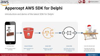
Watch this video by Jim McKeeth, as a comprehensive introduction about why you can love both Delphi and Python at the same time:
Table of Contents
What is the Matplotlib Library?

Matplotlib is a comprehensive Python library for creating static, animated, and interactive visualizations. Matplotlib produces publication-quality figures in a variety of hardcopy formats and interactive environments across platforms.
Matplotlib makes easy things easy and hard things possible.
- Create publication-quality plots.
- Make interactive figures that can zoom, pan, update.
- Customize visual style and layout.
- Export to many file formats.
- Embedded in JupyterLab and Graphical User Interfaces.
- Use a rich array of third-party packages built on Matplotlib.
How do I get the Matplotlib library?
You can easily install Matplotlib with pip:
|
1 |
pip install matplotlib |
Or, you can choose conda install, to avoid complexities, as Anaconda is known as the most trusted distribution for Data Science related tasks:
|
1 |
conda install -c conda-forge matplotlib |
How do I build a Delphi GUI for the Matplotlib library?
The following is the user interface structure for our project:

Here is the list of Components used in the Matplotlib4D demo app:
- TPythonEngine
- TPythonModule
- TPythonType
- TPythonVersions
- TPythonGUIInputOutput
- TForm
- TMemo
- TOpenDialog
- TSaveDialog
- TSplitter
- TImage
- TPanel
- TLabel
- TComboBox
- TButton
Navigate to the UnitMatplotlib4D.pas, and add the following line to the FormCreate, to load our basic matplotlibApp.py:
|
1 |
Memo1.Lines.LoadFromFile(ExtractFilePath(ParamStr(0)) + 'matplotlibApp.py'); |

And make sure that the matplotlibApp.py is in the same directory as our Matplotlib4D.exe or inside your Delphi project folder.
How to visualize data using Matplotlib on the Delphi app?
Highly recommended practice:
1. This GUI was created by modifying Python4Delphi Demo34, which makes us possibly change the Python version in the runtime (this will save you from the seemingly complicated dll issues).
2. Add “Jpeg” to the Uses-list at the top of our UnitMatplotlib4D.pas code. We have to do that, because otherwise, Delphi can not understand the JPG format. With this correction, it should work.
After that, the above change should look similar to this:

And we can load JPG images into our TImage.
3. Set up these paths to your Environment Variable:
|
1 2 3 4 5 |
C:/Users/ASUS/AppData/Local/Programs/Python/Python38 C:/Users/ASUS/AppData/Local/Programs/Python/Python38/DLLs C:/Users/ASUS/AppData/Local/Programs/Python/Python38/Lib/bin C:/Users/ASUS/AppData/Local/Programs/Python/Python38/Lib/site-packages/bin C:/Users/ASUS/AppData/Local/Programs/Python/Python38/Scripts |
4. Creating a GUI for Matplotlib means that you will use Matplotlib outside the “normal” command-line process. You need to add these lines to all your Python code:
|
1 2 3 4 5 6 7 |
import matplotlib import matplotlib.pyplot as plt matplotlib.use("Agg") … plt.savefig("matplotlibPlot.jpg") |
We strongly recommend you name your image output as matplotlibPlot.jpg, to enable it to load automatically on your GUI after clicking the ”Show plot” button.
5. Set MaskFPUExceptions(True); to the UnitMatplotlib4D.pas file, to avoid the Delphi raises an exception when floating operations result produce +/- infinity (e.g. division by zero) that caused by incompatible with a number of Python libraries such as NumPy, SciPy, pandas, and Matplotlib.
One of the best parts of this Matplotlib4D Demo GUI is you can choose the Python version you prefer, and it can be interchangeable.

As we’ve already tested this GUI for regular Python and Anaconda Python, this Matplotlib4D GUI works best for both Python versions.
Next, click the “Execute” button to run the very basic example to plot heatmap with annotation (the Python code is already called inside the UnitMatplotlib4D.pas file), and click the “Show plot” button to show the figure. Here is the output:

How to learn the fundamentals of data visualization with Matplotlib on the Delphi app?
Examples of implementations:
1. Heatmap: Annotated heatmap
Context: We often want to show data that depends on two independent variables, or visualize the strength of correlations between two variables as a color-coded image plot. This data visualization technique is often referred to as a heatmap. If the data is categorical, this would be called a categorical heatmap.
The following examples show how to create a heatmap with annotations, which help us to read the quantity on top of the color-coded plot.
Here is the default example embedded on the Matplotlib4D GUI:

You can download the script here.
2. Barchart: Horizontal bar chart distribution
Context: Stacked bar charts can be used to visualize discrete distributions. Stacked bar charts are commonly used to visualize distributions, segments, or survey results.
This example visualizes the result of a survey in which people could rate their agreement to questions on a five-element scale.
Load the demo02_horizontalBarchartDistribution.py at runtime by clicking the “Load script…” button, and then “Execute”. Here is the output:

3. Subplot & Line Chart: Subplots showing damped vs undamped oscillation
Context: Sometimes we want to compare two or more plots head-to-head, to visualize the difference between two conditions. For example, in Physics, we want to plot the damped vs undamped oscillation.
Load the demo03_subplot.py at runtime by clicking the “Load script…” button, and then “Execute”. Here is the output:

4. Scatterplot with varying marker colors and sizes
Context: Visualize relations between two variables (usually to find trends and the tightness of the relations), with other additional variables visualized using variations of marker’s colors and sizes.
Load the demo04_scatterplotWithVaryingMarkerColorsAndSizes.py at runtime by clicking the “Load script…” button, and then “Execute”. Here is the output:

5. Anatomy of a figure
Context: To get the most out of Matplotlib, you need to know all the anatomy of a figure or a plot. In this example, we will learn them all.
Load the demo05_anatomyOfAFigure.py at runtime by clicking the “Load script…” button, and then “Execute”. Here is the output:

Such a powerful data visualization library, right?
Are you ready to try these Matplotlib for Delphi demos?
Congratulations, now you have learned a lot about Matplotlib: A powerful data visualization library, and how you can use Delphi to create a simple yet powerful GUI for it! We have learned the fundamentals of data visualization examples, and now you can explore them to boost your productivity in creating your own data visualization apps.
For a more Pythonic point of view, you can refer to this article:
and if you are looking for other powerful data visualization libraries, please read this article:
Download a free trial of RAD Studio Delphi today and try out these examples for yourself.

Design. Code. Compile. Deploy.
Start Free Trial Upgrade Today
Free Delphi Community Edition Free C++Builder Community Edition